Spring 2023
Project Overview:
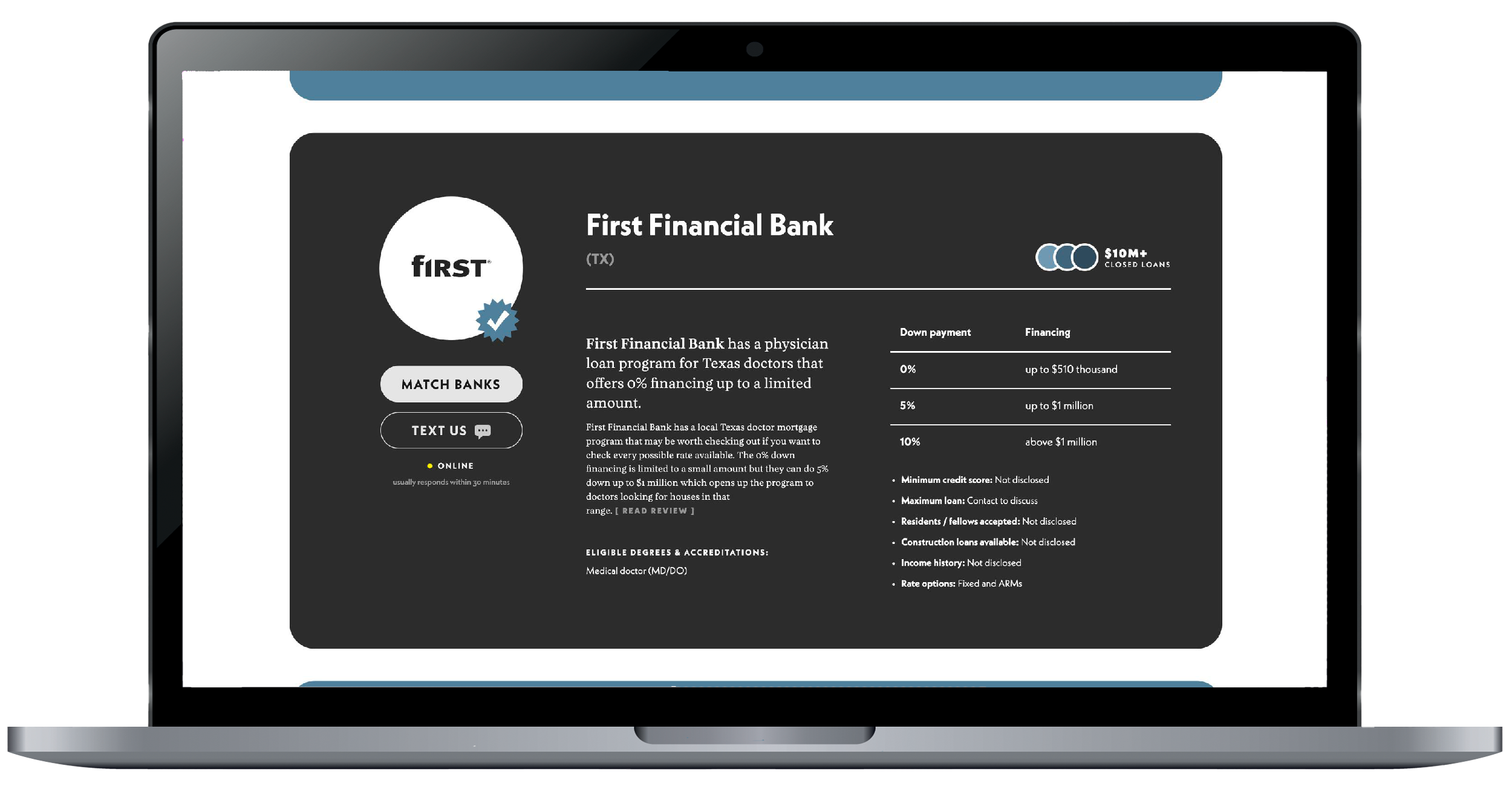
While working at The Biglaw Investor, I was asked to create the foundation for a new “call-to-action” method the company wanted to try out. The Biglaw Investor is a company that helps lawyers and doctors manage their finances by providing bank represetatives, loan information, and investing knowledge. One of their services is connecting physicians across america with banks that best suit their needs. They already had a well written article that explained all you need to know about how to select the right bank and who to talk to. However, they had a low conversion rate of people coming to the article and using their concierge service that directly connects the physician with a bank representative of their interest. I was then asked to design new digital cards that enticed the reader to head to the concierge. These cards should display necessary bank information while staying transparent about the service the Biglaw provides.
Role: Assistant Designer
Timeframe: 2 months
Tool: Figma
Role: Assistant Designer
Timeframe: 2 months
Tool: Figma
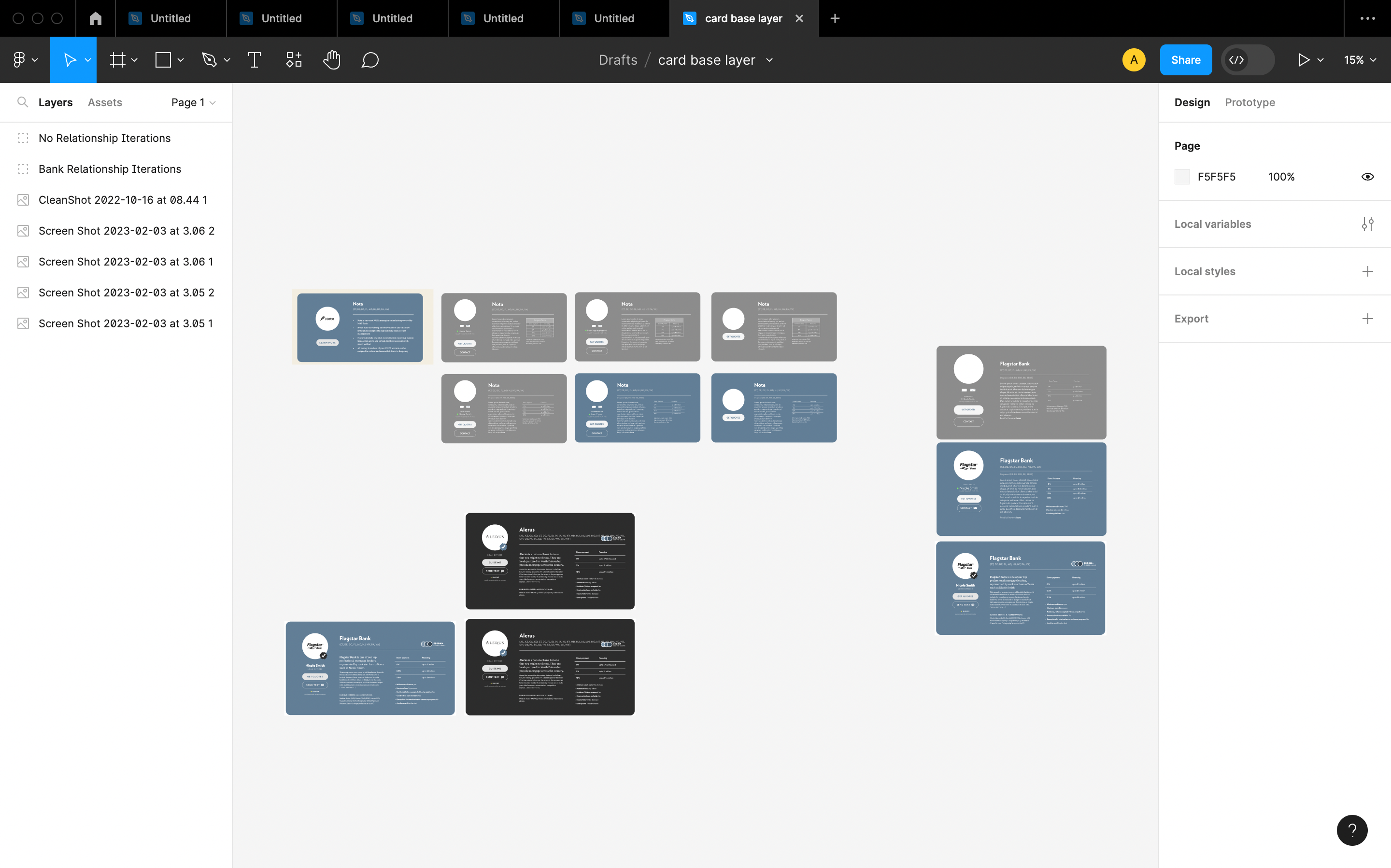
Initial Design
I was given an old card that was no longer in use on the website to build on. In Figma, I made several iterations that provided more information than the old card while maintaining the brand identity. I had to make two different types of CTA’s, or call-to-actions. One that offered a bank that Biglaw has a relationship with, and one that Biglaw does not.
Design Goals
My objective was to keep this simple. Biglaw has a distinct brand style that I am careful to not stray from. They keep rounded edges and long buttons and have a typographic hierarchy in place. There is a universal understanding that cards that display a rounded image with information about said image will inevitably read like a social media profile. I wanted to play with this design system by pushing it in that direction. After all, we are listing a widely known bank and stating all of their best features, much like a social media profile does. Another inspiration that pushed forward the design, is baseball cards. Baseball cards are a more literal comparison that applies to the end goal of this new feature. We want to, in a limited space, display all of the best features of this bank and mention who the bank representative is in order to get the reader to click on the contact button and reach the concierge.
Things I kept in mind:
︎ My audience is doctors and physicians
- They will first look to see if their degree is applicable in the state they reside in before reading extra information.
- While they may be interested in a summary of how the bank can directly benefit them, reading about the down payment and financing options gets straight to the point.
︎ Language
- Biglaw wants to be transparent that their readers will go through the concierge before actually connecting with a representative. Selecting language that does not directly mislead the physicians to the next step is key.
This is my initial wireframe for a bank that Biglaw has a relationship with:
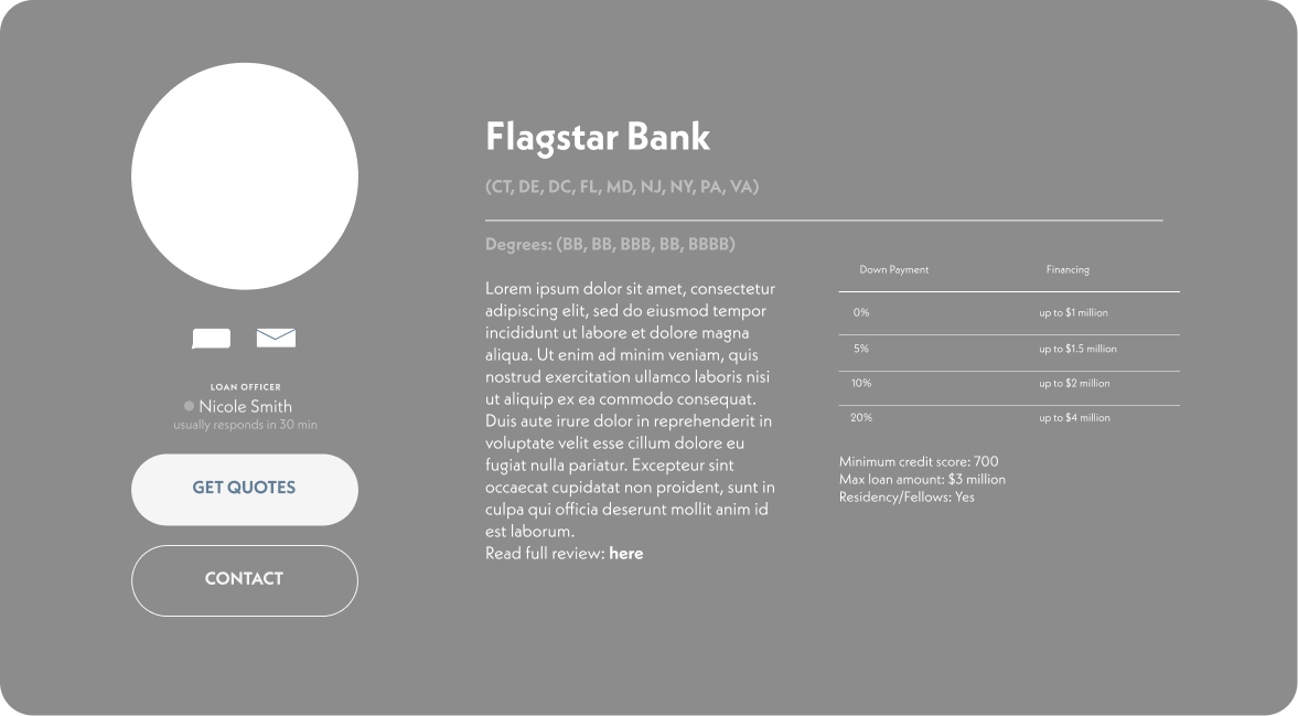
Color Wireframe
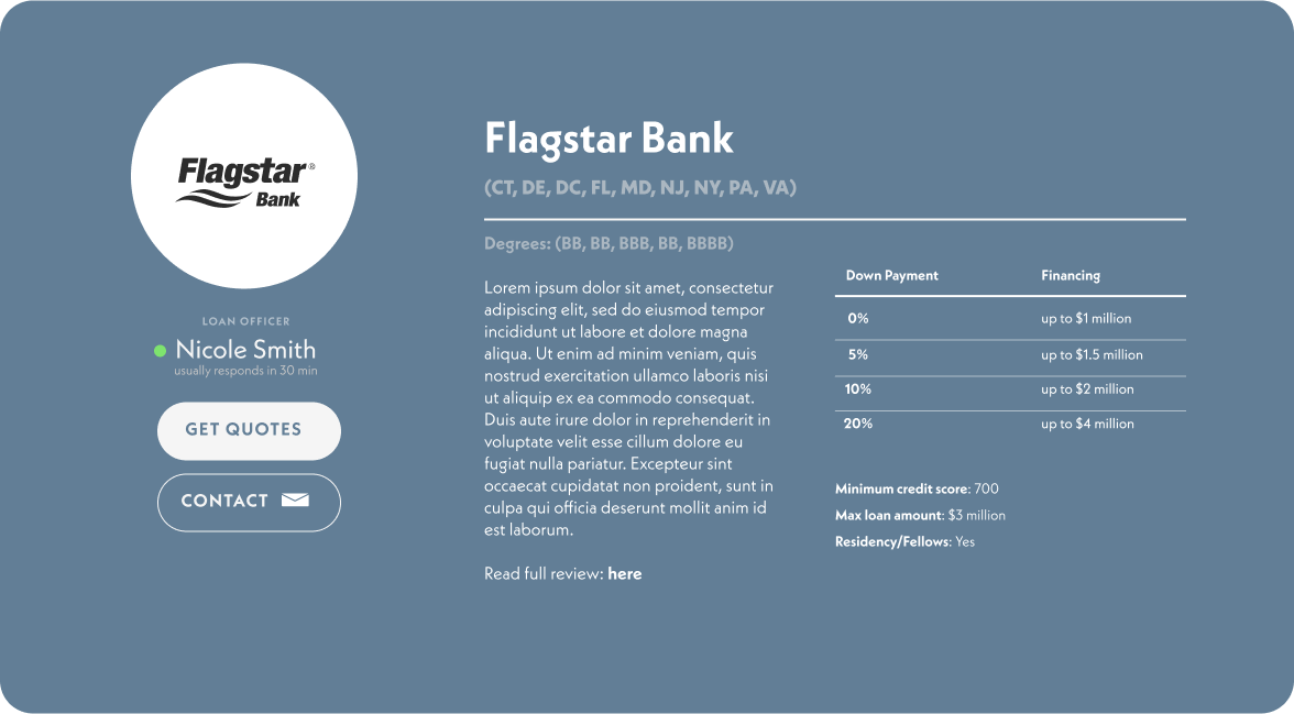
Final Development
Turnout
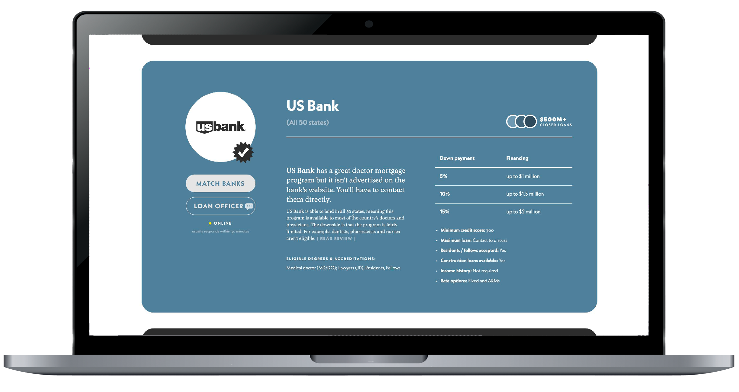
After the release of the cards, Biglaw saw an increase in people visiting the physician loans article and conversions to the concierge service. Here is the page they exist on.