Summer 2022
Project Overview:
During my summer internship at PenFed Credit Union, I was asked to audit the current company website of inconsistencies and find opportunities to correct the information architecture. The company was going to start the process of creating and designing templates to unify their service and product pages. I was asked to build the initial mockups of these templates through my analysis of their current site layout. These mockups were to be constructed with the existing design components created by the senior ui designer in medium to high fidelity wireframes.
Role: User experience designer and researcher
Timeframe: 3 months
Tool: Figma
Role: User experience designer and researcher
Timeframe: 3 months
Tool: Figma
Initial Research
I combed through PenFed’s checking, savings, certificate, IRA, and loans service and product pages and took notes on their information architecture. I had one goal in mind: I need to reduce cognitive overload by gathering the most necessary information and spread it across all services in a structure that is flexible and uniform. Here was my analysis:
Penfed’s website was displayed in two different design systems. This is because they had issues fully converting to a newer system due to third party businesses intervening. They also repeatedly displayed large amounts of information on single pages. Without a UX copywriter, they struggled with condensing the information given by these third parties. Each overview and product page, for products such as loans or checking, had cognitive overload. I needed to produce templates that included the necessary requirements demanded by the line of businesses while simultaneously using the new design system components to offer a solution to this problem.
Note taking done on Invision Whiteboard


Current Experience
Design Decisions
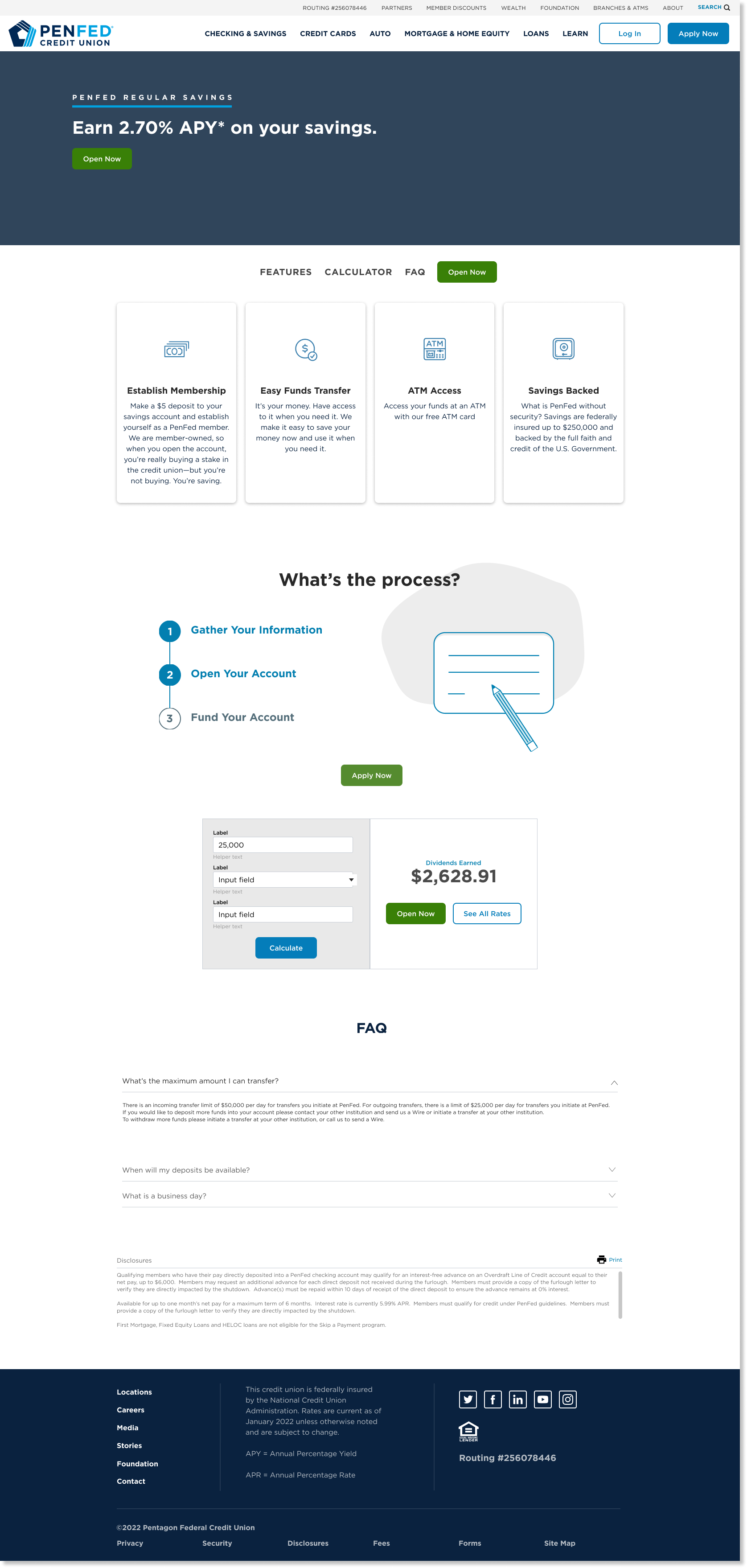
Due to the number of pages I annotated, I decided to dissect my design choices for checking and savings service and product pages. PenFed currently has three pages for checkings and four for savings. Both have one overview section, leaving the rest as product display. This entire section is a perfect display of both combatting design systems. Checkings is displayed in the newer system and savings is displayed in the old one. I needed to create two templates that apply to all seven pages. One for the overview and one for the product display. Here are some major design choices I made:
︎ Remove repetitive information
︎ Simplify callouts
︎ Unify inconsistencies
︎ Reduce images
︎ Remove repetitive information
- PenFed displays additional features and benefits on each product display page. This information is also relatively the same across all products.
- My template offers an option to display these on the overview page so users can toggle through the options and physically look at all the services while making a decision
︎ Simplify callouts
- The checkings and savings overview and product pages all contain a callout for PenFed’s mobile app. This information can also be brought to the overview and removed from product pages to focus the users attention to the product features.
︎ Unify inconsistencies
- Throughout the seven pages, the information architecture was very inconsistent and lacked uniformity. I averaged out the general layout that would follow their company design image while maintaining a structure that is easy for a user to follow.
︎ Reduce images
- On top of having a large quantity of information, PenFed displays many low-res images in almost all sections of their pages. I centered a large part of my process of framing components around avoiding unnecessary images.
Initial Wireframes
Overview:
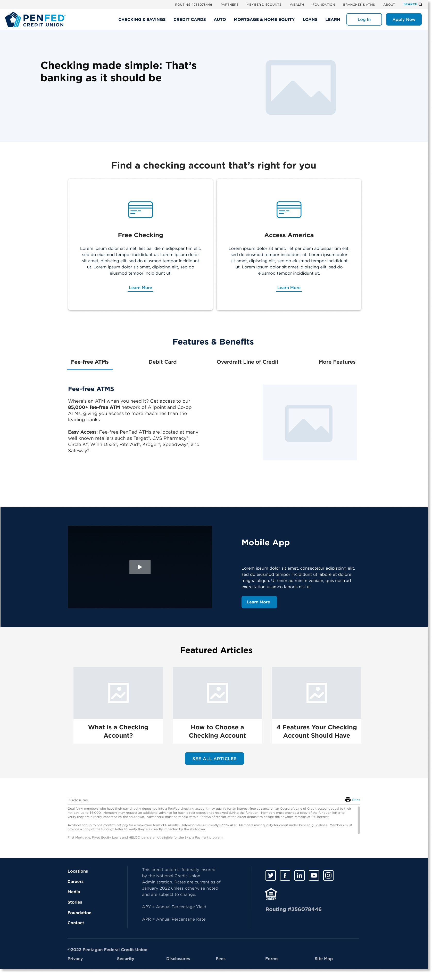
Product Display:
Takeaway
These templates, overview and product, can be applied to all checking and savings account pages. In the current pages the content does not tell me enough about the product and it instead displays unrelated information. Having one callout sticking to the overview page reduces overload by a lot. When callouts are so repetitive, it can become either distracting from the product, or just an obstacle to get to where you want to be. In the product display, reading about the process on how to apply for an account and testing out the calculator are great selling points for each saving and checking account. Having those, as well as features and benefits listed, is good information that a consumer will probably be looking for. I decided to keep the faq only on the product page to keep the information concise. There is no need to list this in both overview and product as that will cause information overload. The same applies to the featured article. Overviews should be seen as a general learning space. It makes more sense to leave the featured article for that area rather than the product pages.
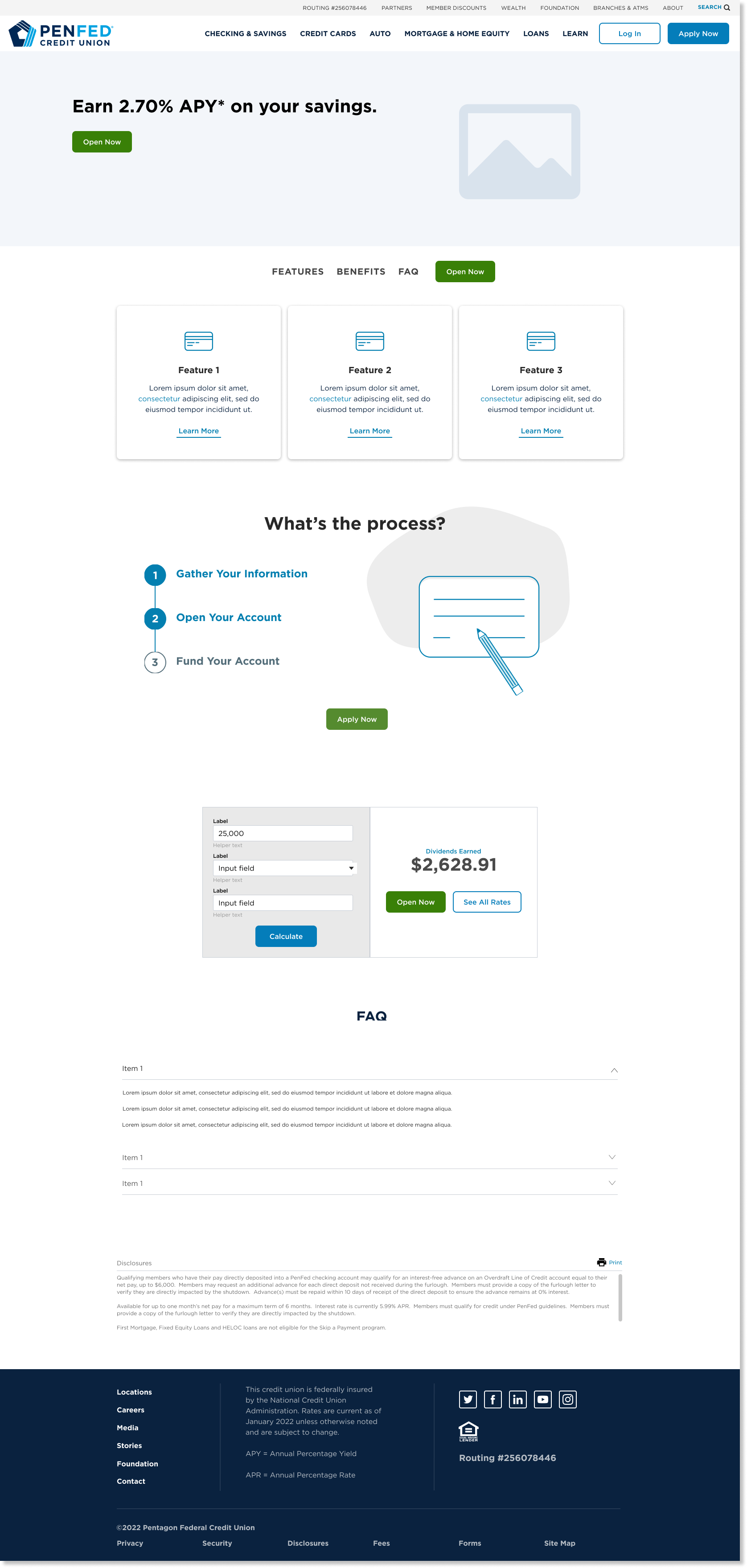
Final Wireframes
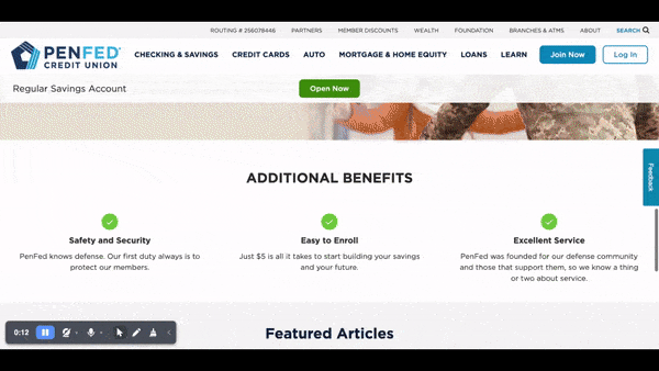
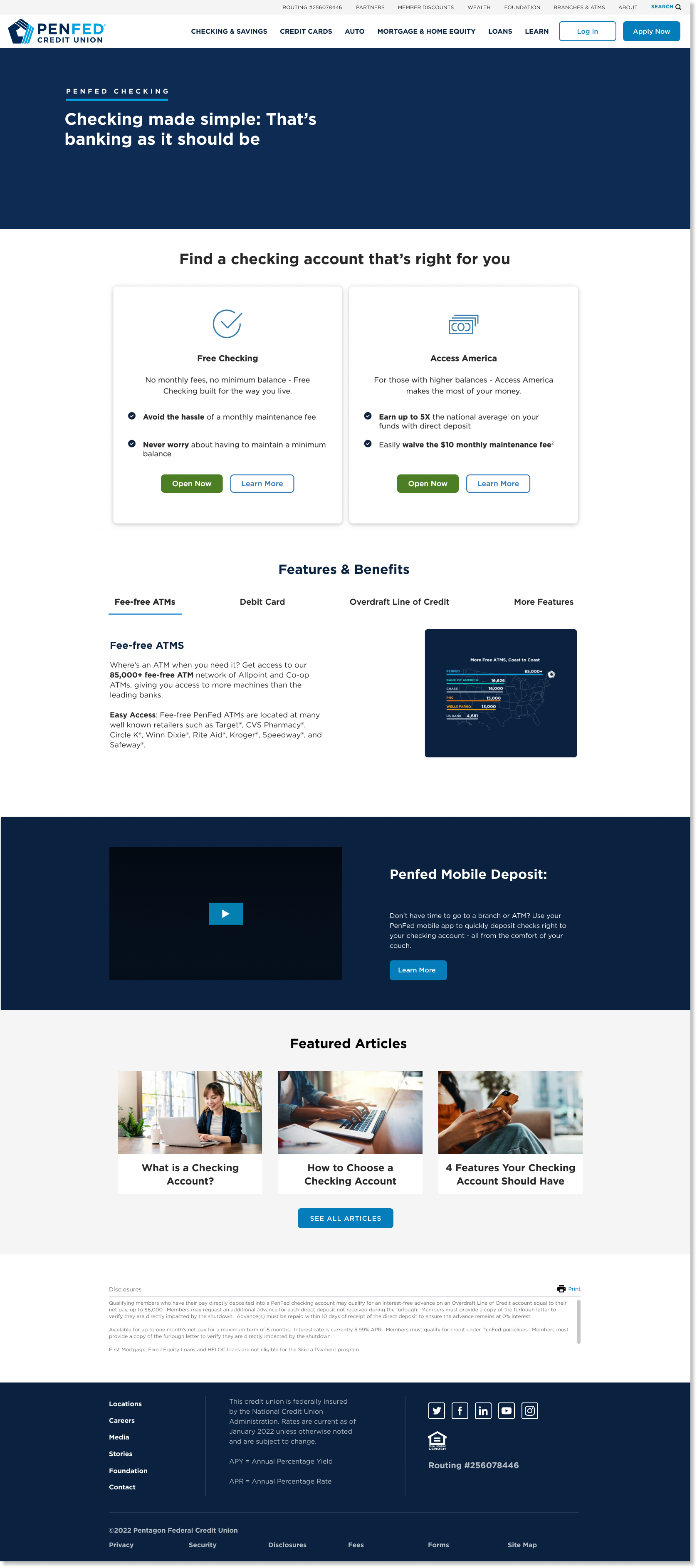
Sample of the checkings overview page:
Sample of PenFed’s Regular Savings product:
Next Step
After a long time of presenting this information, PenFed will take my research and templates to high level prototyping and incorporate it in the launch of the new site! My research was the first step to a long process of rebranding the ui of the main website. The design team will now need to fix other parts of the site to match this information architecture and present their findings to the lines of businesses.