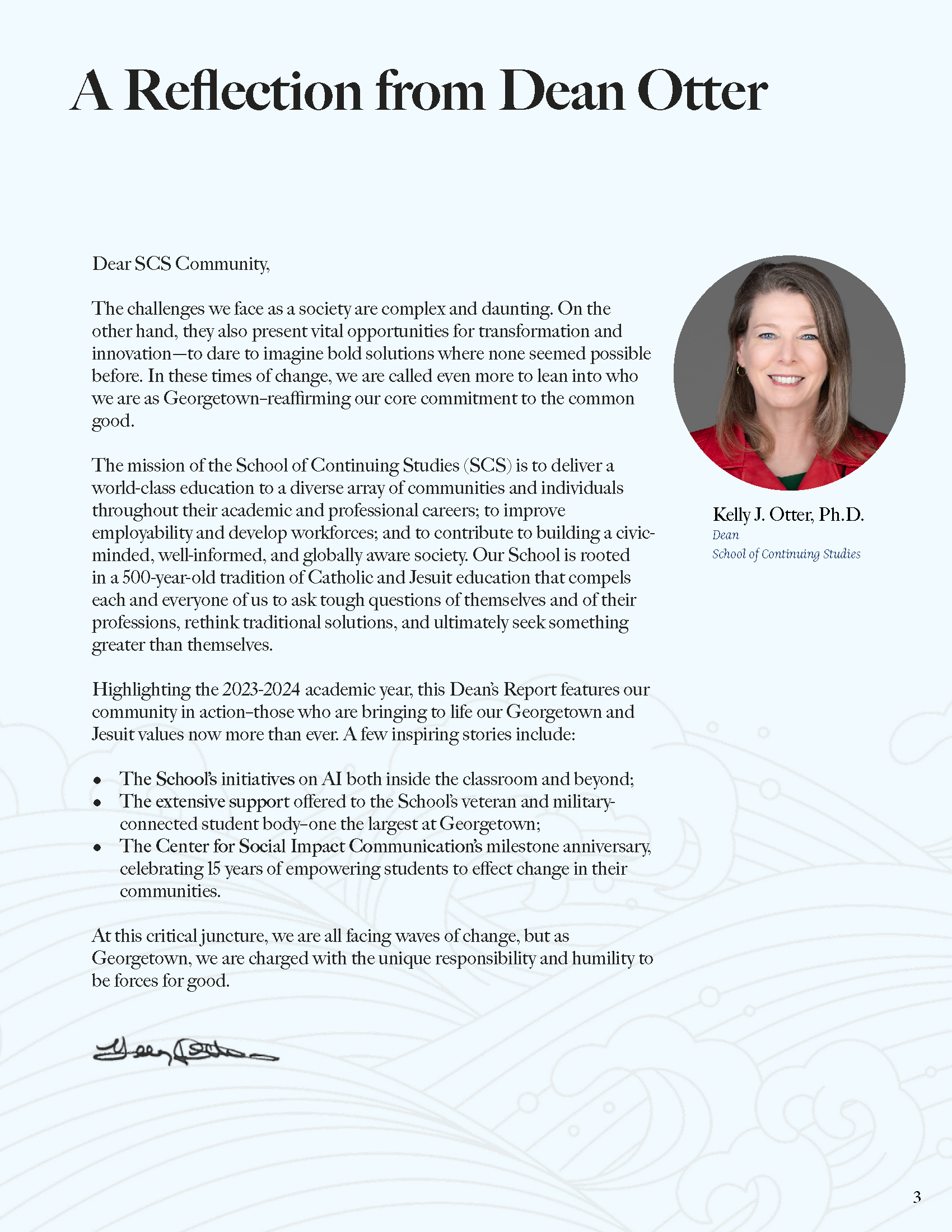
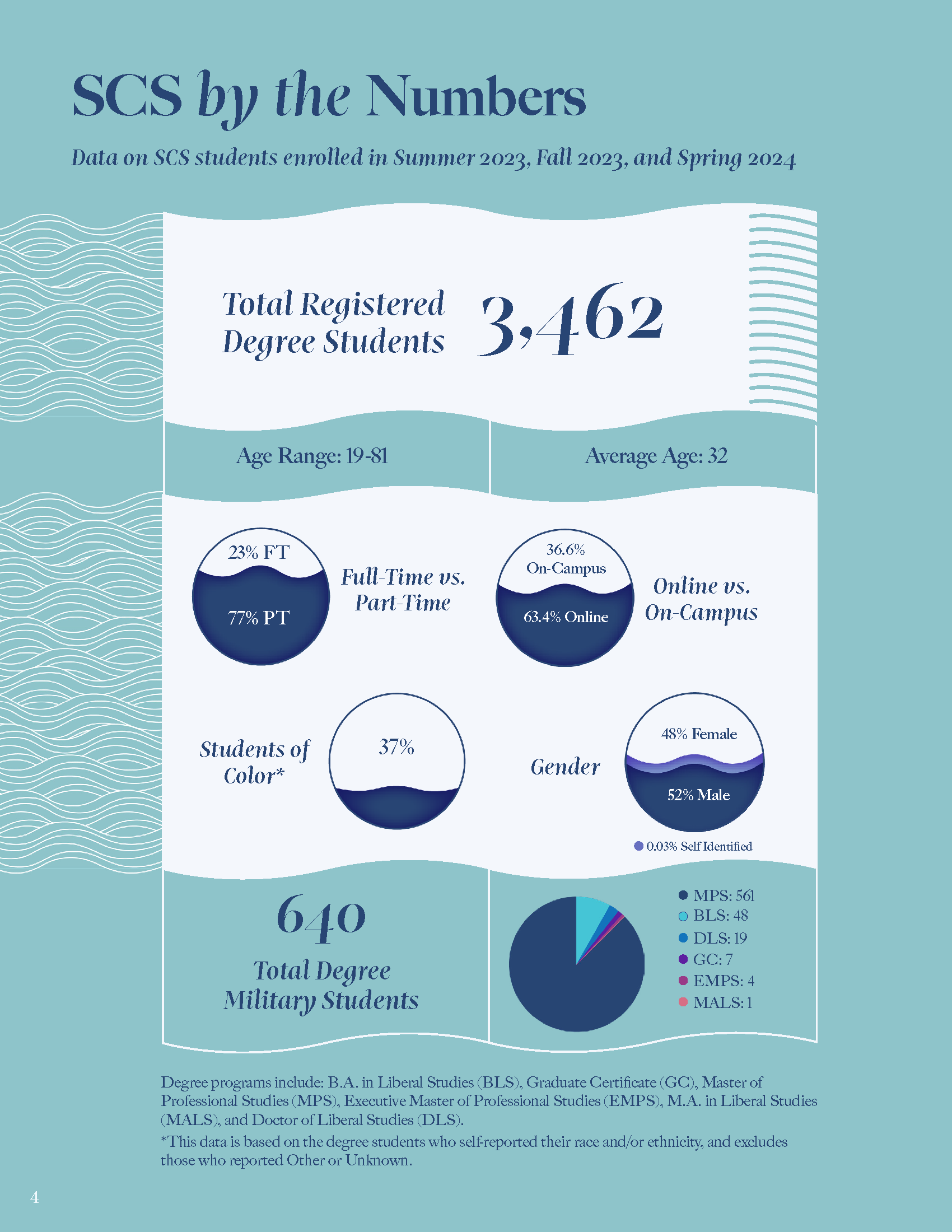
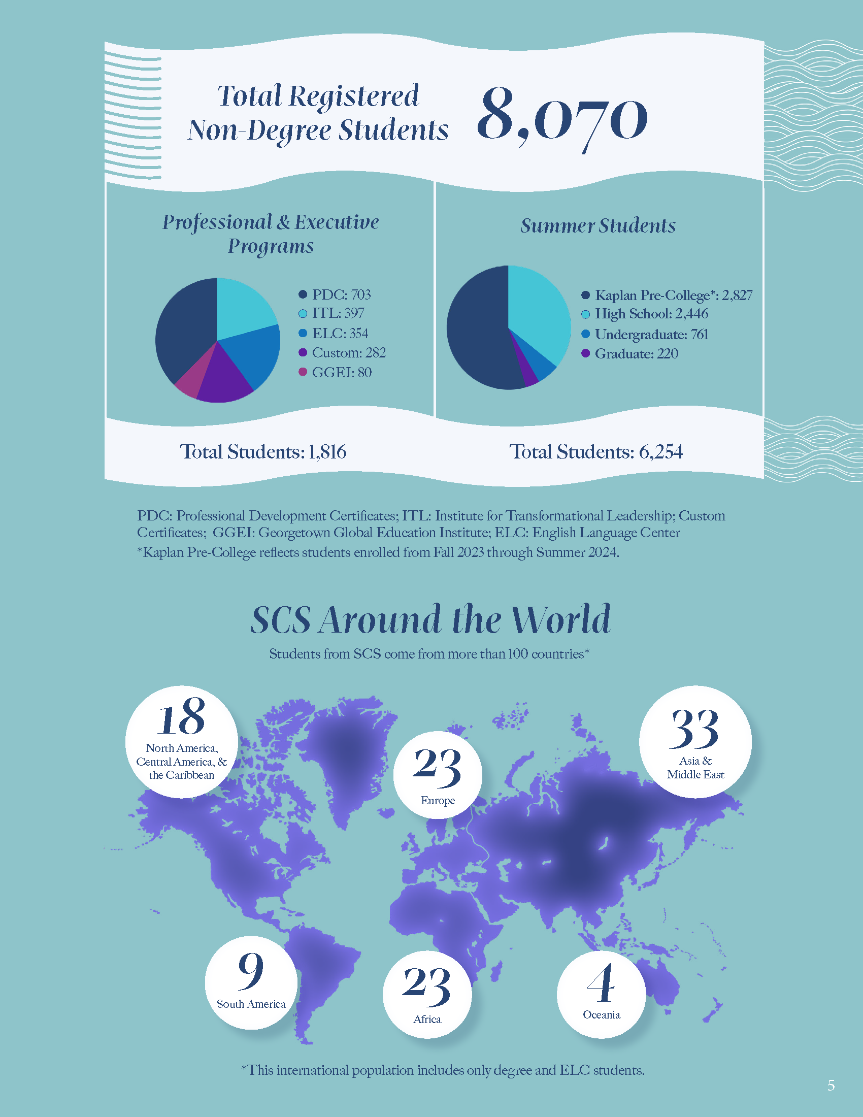
- Dean’s Report
- ︎︎︎ Canvas UI
2024-2025
The School of Continuing Studies Dean’s report was designed solely by Anu Iyer and no others. The theme reflects the ocean’s waves as a reflection of the ever-changing experience of SCS. Link to PDF
Tools: Adobe InDesign & Illustrator
Tools: Adobe InDesign & Illustrator
Dean’s Report
Canvas UI
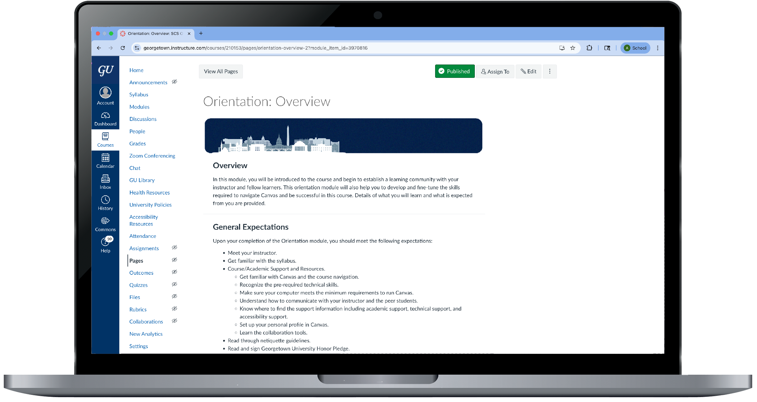
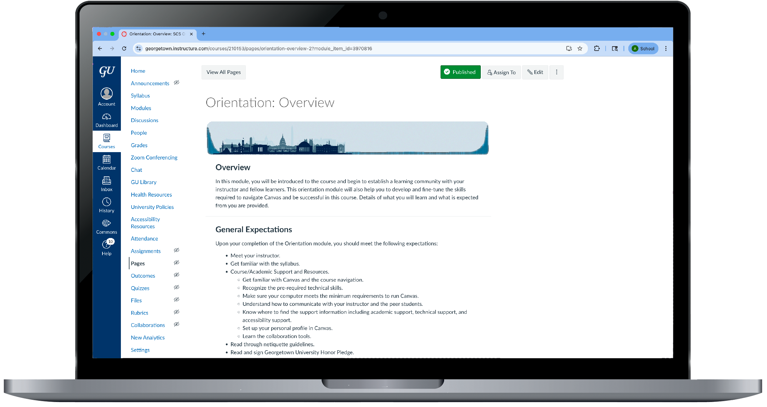
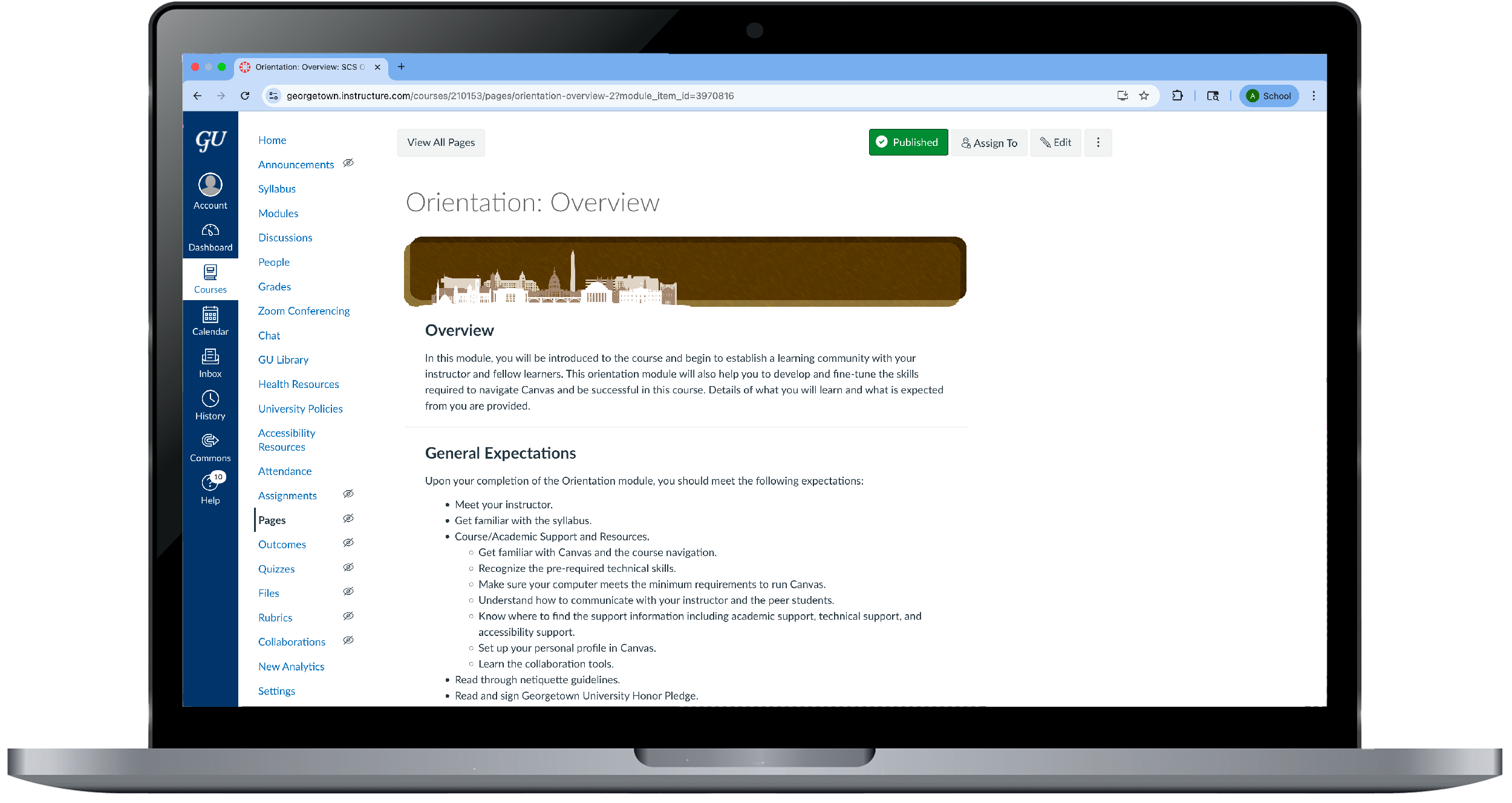
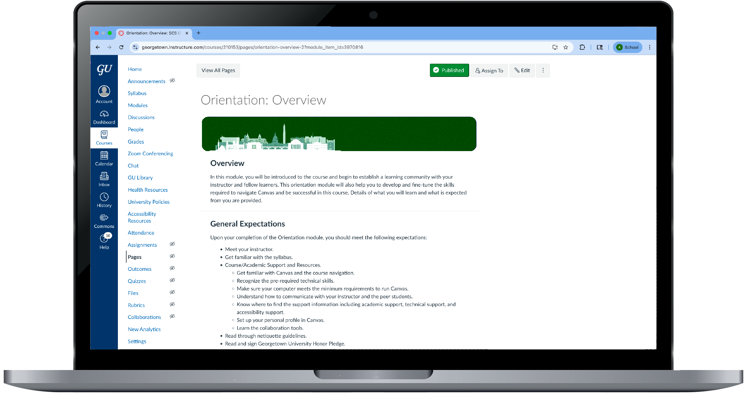
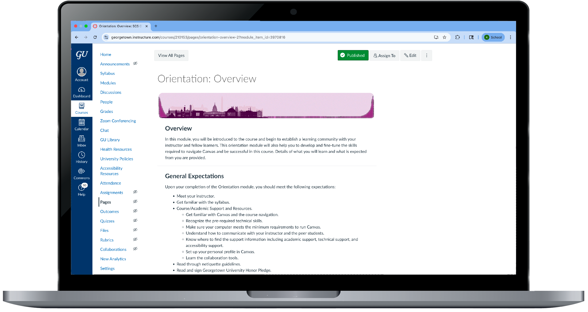
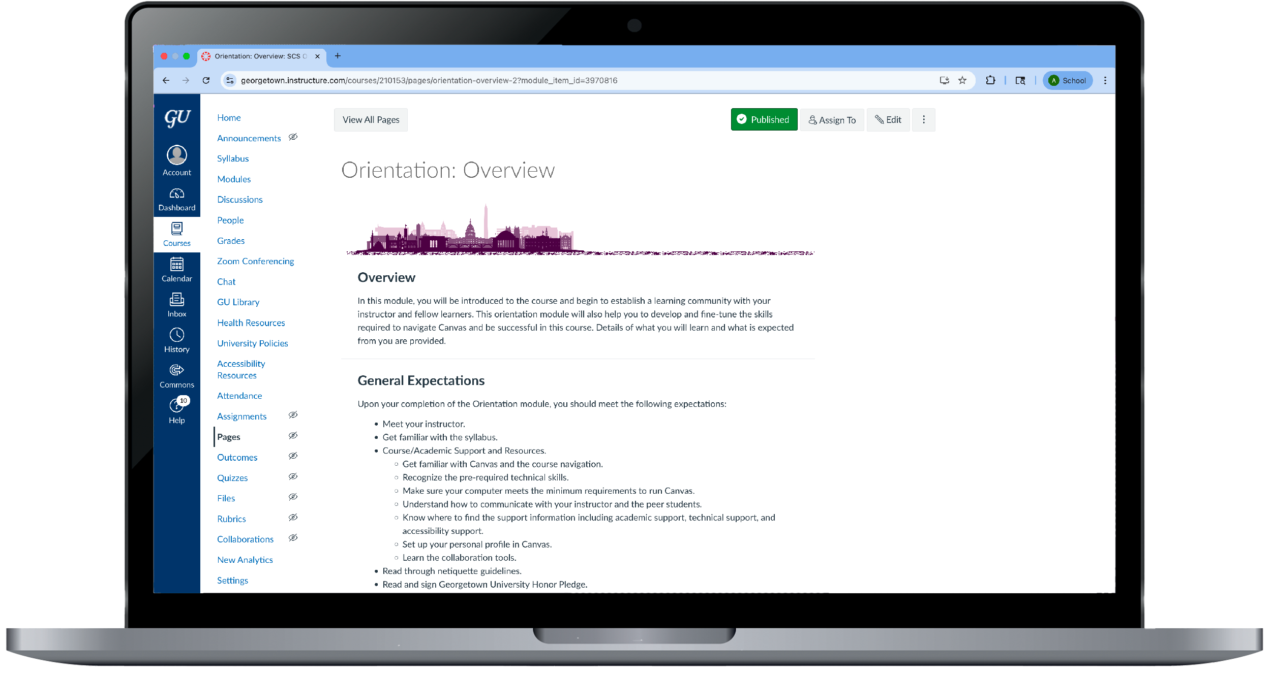
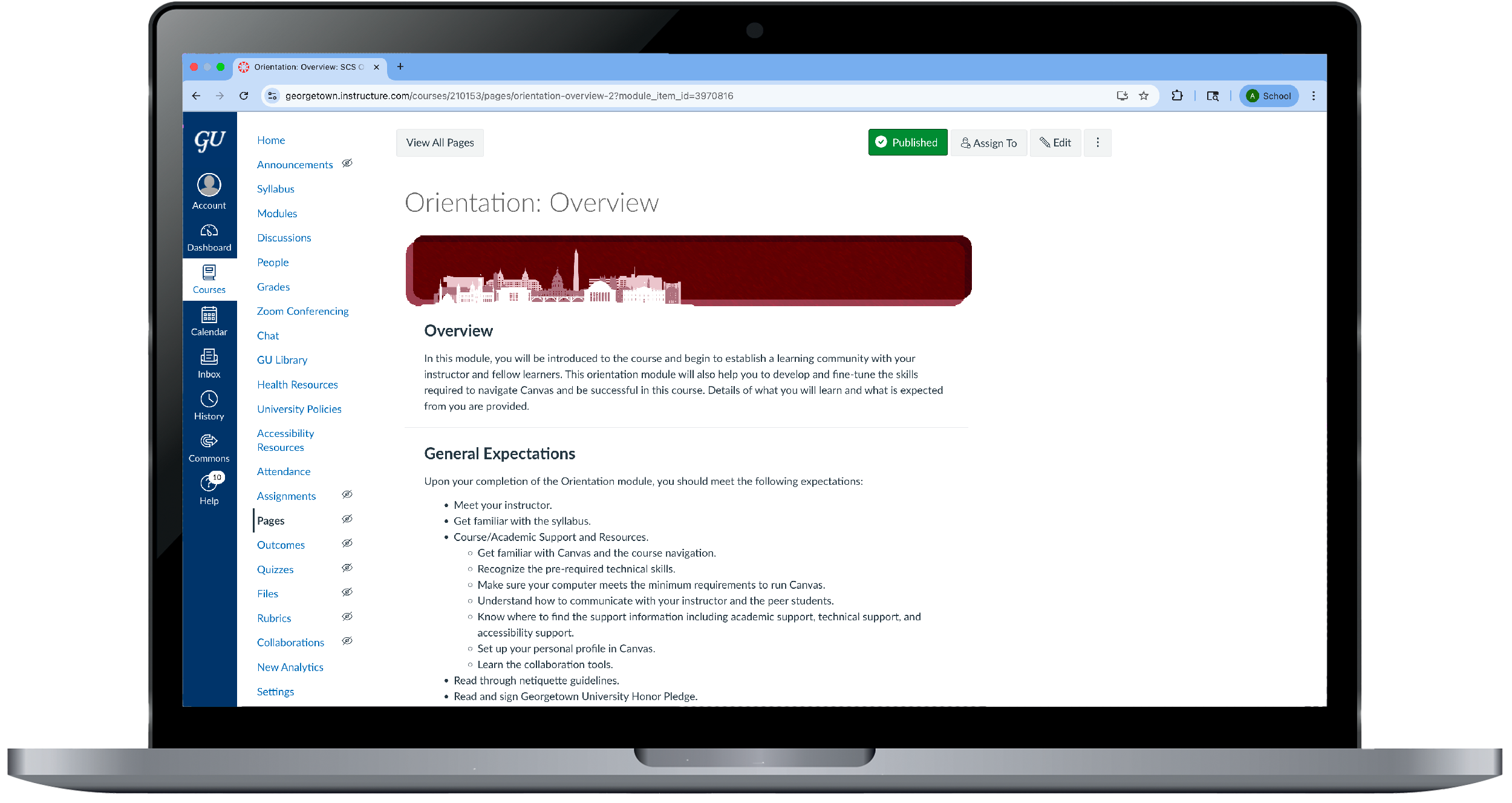
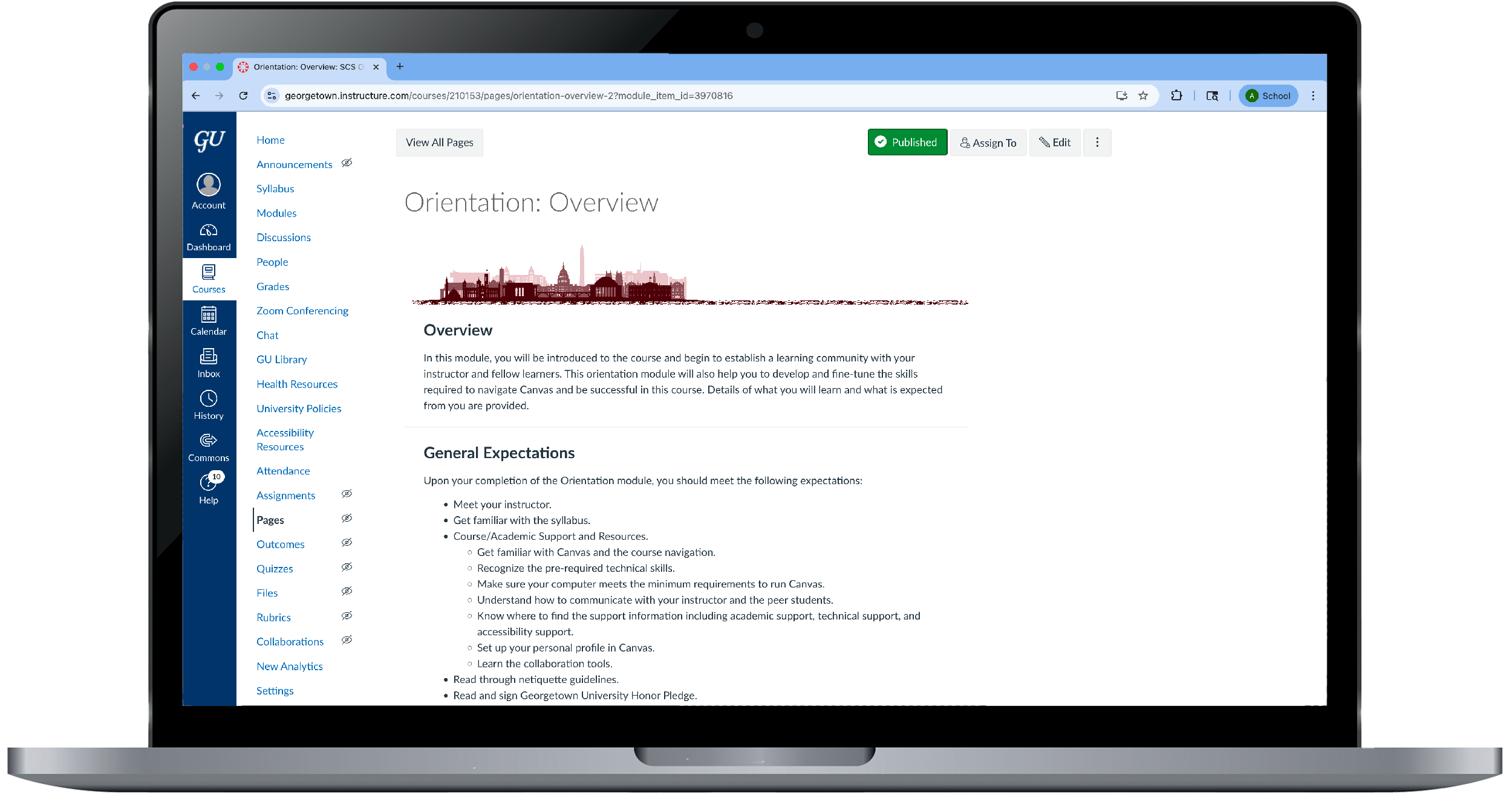
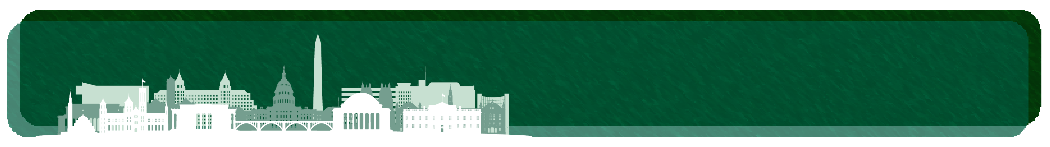
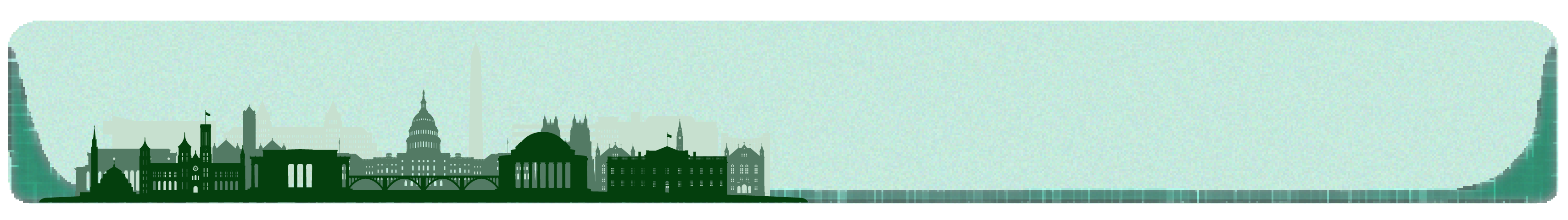
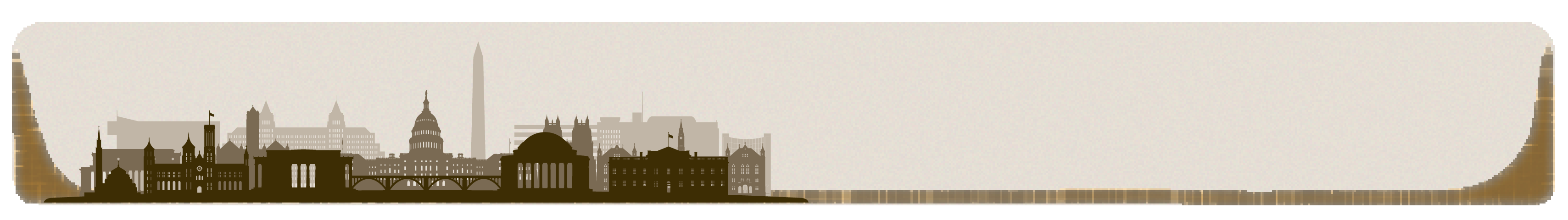
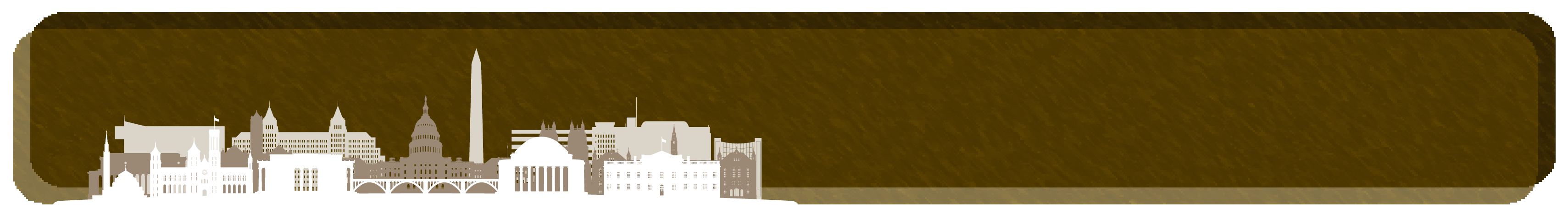
Project Overview: SCS had an outdated, crowded layout for all of their course displayed on Canvas. They had asked me to redesign the media in a manner that would reduce day-to-day work for the instructional designers and modernize their front-end.
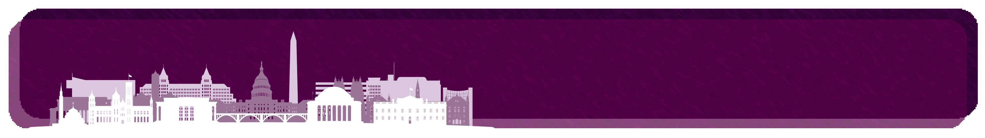
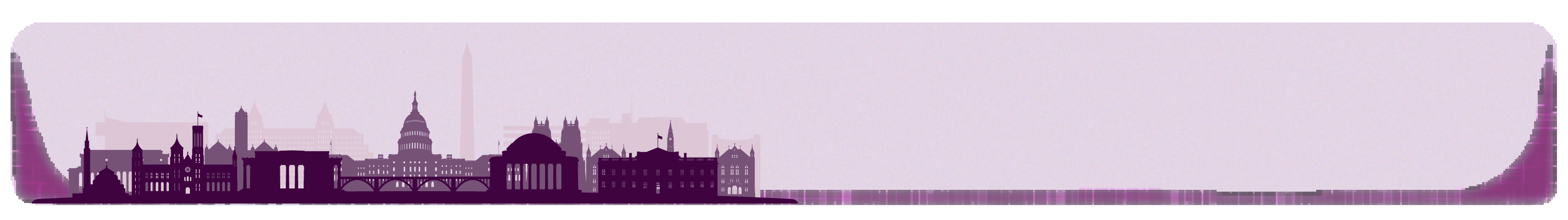
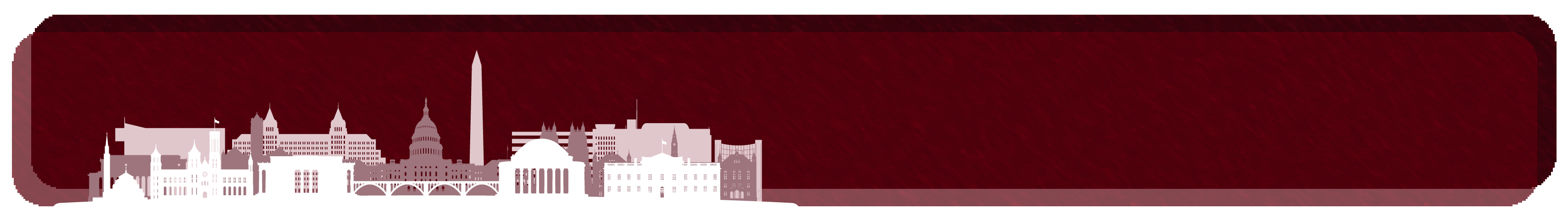
Design Decisions: Their previous banner took up too much space and caused students to scroll down to view their material. It also contained personalized titles in each banner per page per module. Lastly, it contained an image that was used on each course's homepage. This caused every course to have 50-70 banners to be created by hand and exported individually to upload to each module page. Here are the design decisions I took to solve these issues:
︎ Remove titles and custom images
︎ Convert file to SVG
︎ Limit the color palette and customizability
Design Decisions: Their previous banner took up too much space and caused students to scroll down to view their material. It also contained personalized titles in each banner per page per module. Lastly, it contained an image that was used on each course's homepage. This caused every course to have 50-70 banners to be created by hand and exported individually to upload to each module page. Here are the design decisions I took to solve these issues:
︎ Remove titles and custom images
-
By removing the title and custom image, the designer would not have to export so many banners and export only one to be used across the entire online course.
-
The instructional designer will only need to upload one image that can be duplicated to every module page instead of having to upload custom ones.
︎ Convert file to SVG
- Keeping digital assets in SVG format allows your design quality to remain at its highest quality for every monitor size.
- Banner will upload faster and simplify the page due to the constraints of keeping it as an SVG.
︎ Limit the color palette and customizability
- Like most organizations, Georgetown faces issues where certain faculty will perceive some designs as professional, and others not. By removing the option to customize and limiting the color palette to five colors, faculty will defer to the preset assets and choose which one is to their liking. This keeps SCS courses unified in their branding and identity and cleans up all of their courses.
- By creating four variants under five color options, instructional designers and faculty members have enough options to differentiate courses from each other and maintain a personalized touch while sticking to SCS’s new identity and branding.
Banners


Experience